Need a better UX/UI but a rebuild is (almost) impossible? Just add CSS.
 Gregg Blanchard /
Over the last handful of years I’ve found myself in conversations that all lead to the same question:
Our UX/UI is out of date, we’re losing sales because of it, but a rebuild would be a huge undertaking. We just can’t justify it against other priorities.
The more I chewed on this problem, the more I realized that the answer didn’t have to be a rebuild. The platform worked great, so there was no reason to touch the back end code. All it needed was to look better. Virtually all of that is controlled by a single type of code: CSS. And what’s interesting about CSS is that you don’t have to rip out old CSS to add new styles. The browser simply looks at the last CSS on the page to decide how something should look. I started to wonder:
Could I improve the UX/UI of an interface just by adding new CSS that overwrites existing styles?
IF that worked, not only could we improve the UX/UI in a fraction of the time, because we’re not actually changing the functionality of the platform it could be implemented with a single line of code (a <link src=””> reference) and virtually no testing.
Giving it a Try
So, the next time the situation arose, I offered to take a stab at this approach. It didn’t take long as less than a month later my first opportunity presented itself.
Round 1: Resort Ecommerce
Many of our users at Inntopia were using the default booking engine design that used a tile-based layout, but over and over again we’d be asked for a design that stacked results vertically. We also had old, default Bootstrap 3 elements still visible and the look was getting poor reactions during sales demos.
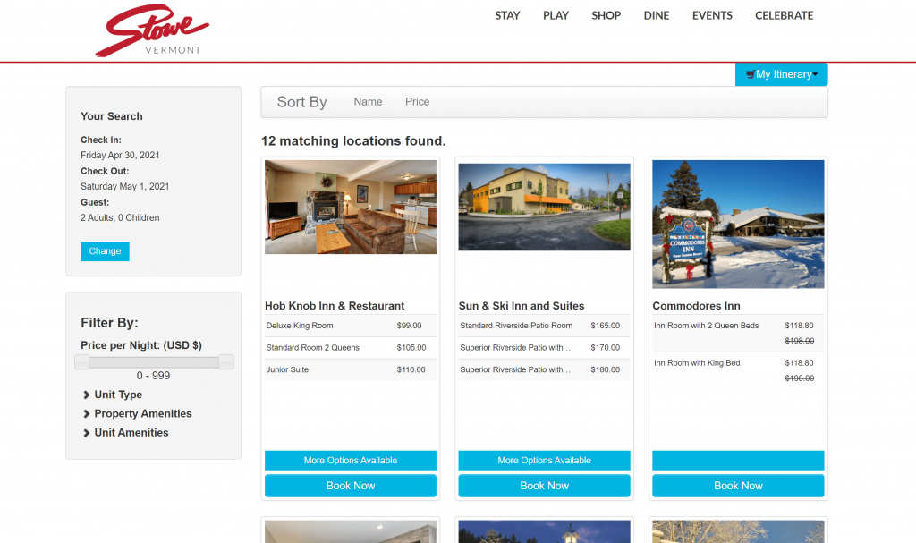
One afternoon I tried writing an additional stylesheet that would overwrite existing styles to see what was possible. A couple hours later, I had my stacked layout along with a couple other small tweaks to add a little more visual hierarchy.
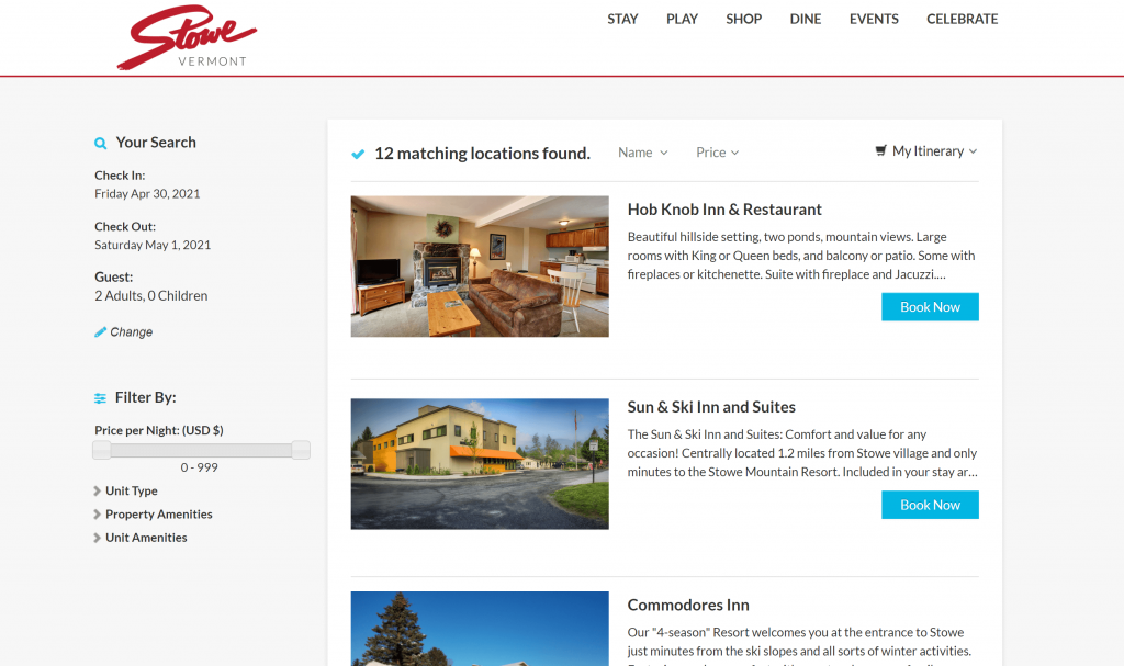
Simple, but promising especially when you consider if only took 2 hours.
Round 2: Query Interface
Shortly after that we discovered that the users of our list builder tool were struggling with the hierarchy and relationship between the criteria they’d built into their query. Initially thought we’d need something close to a full rewrite because the developer who had built this tool had moved on and the code, while working, was a bit of a mess.
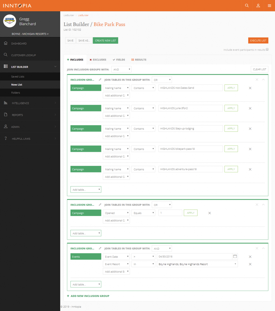
Encouraged by my efforts on the ecommerce interface, we decided to see if I could write an extra stylesheet to add the lines, spacing, and deeper indenting we needed to better convey this structure without a full rewrite of the builder. A few hours of work later, we had a working v0.1. A few days of testing and tweaking later, we were ready to launch.
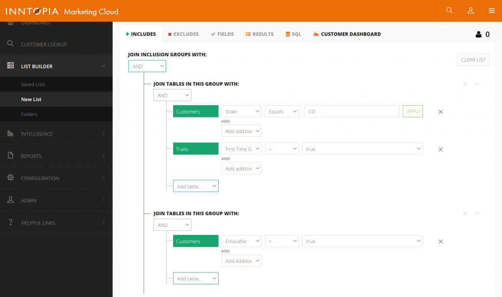
Again, we didn’t touch a single line of existing code: frontend or backend. This was 100% CSS added to the existing page and that’s it.
Round 3: Full User Interface
A few months later our DestiMetrics team expressed frustrations with their portal looking out of date. Seeing that I’d done for the other two interfaces, the team wanted to see if I could update their look and feel as well.

This was my biggest challenge to date. Not just because it was a full interface, but because the code was really, really poorly written with virtually no classes or IDs to target various elements. With a little bit of creativity and patience, though, I was able to make a pretty solid improvement even if some of the polish I hoped for wasn’t possible.
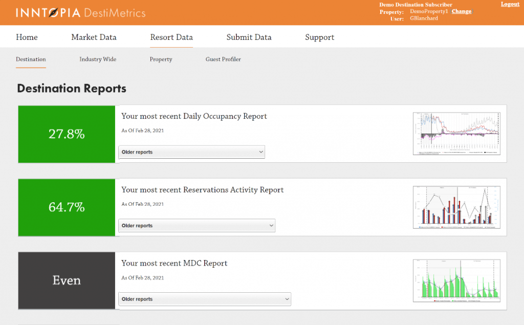
We handed the CSS to the developer who had built it, he added the reference to that stylesheet and, just like that, they had a new interface.
Round 4: Resort Ecommerce Revisited
A couple years after that first attempt at our resort ecommerce platform, it was again time to think about updating the design. And for good reason, I hadn’t really intended to do anything more than test out the theory the first time around so I didn’t take it as far as I now realized I could. This time around gave me a chance to do it right.
So, I took everything I learned and – at least in this case – added a little javascript to move a couple elements around to give us the opportunity to showcase categories in a more visible area. I spent some time in the code to double check my constraints, then spent a couple weeks on a design, and then shipped a POC that looked like this.
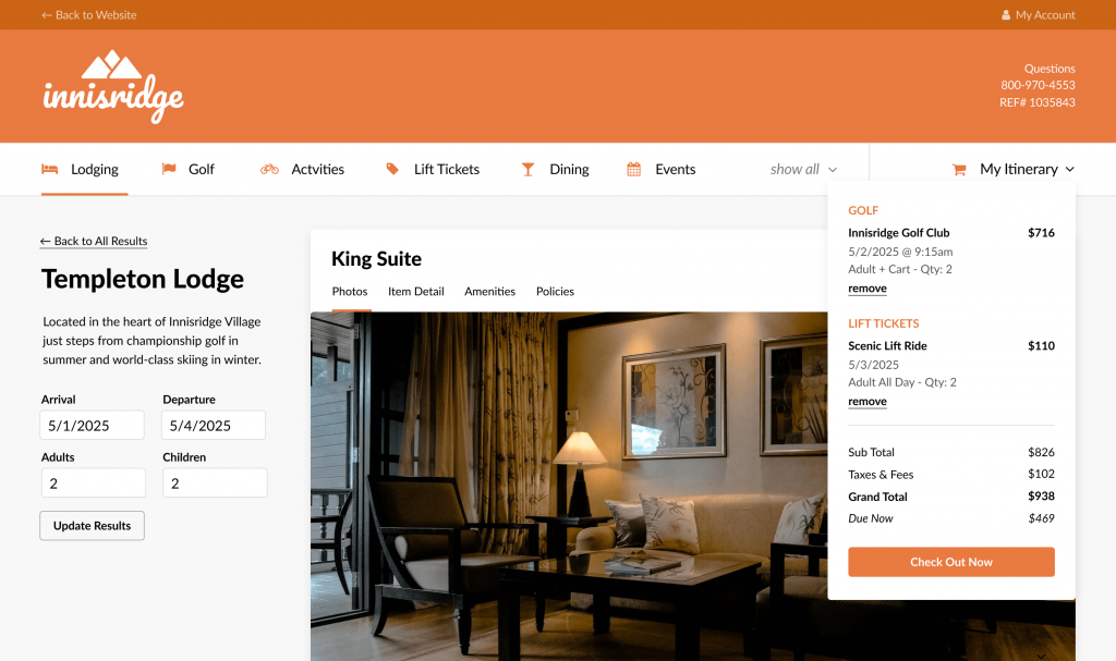
Shortly after an engineer was assigned to make this a reality.
I was really fun to see these funny little “overwrite UX/UI styles with CSS” skill really start to blossom with this project.
Round 5: User Sign Up Form
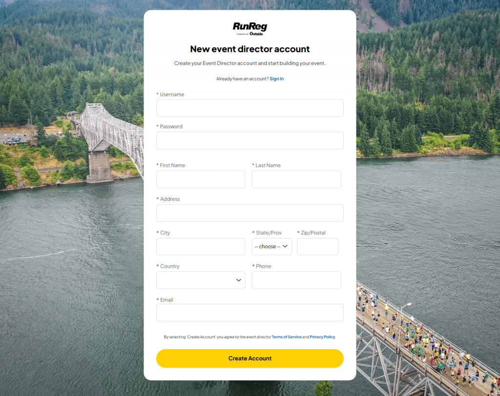
After Outside acquired Inntopia and I started working with the athleteReg team, we were looking for ways to improve the performance of the form event directors used to create an account. That form was outdated and clunky and we hoped that a refresh would increase conversion on our new user funnel.
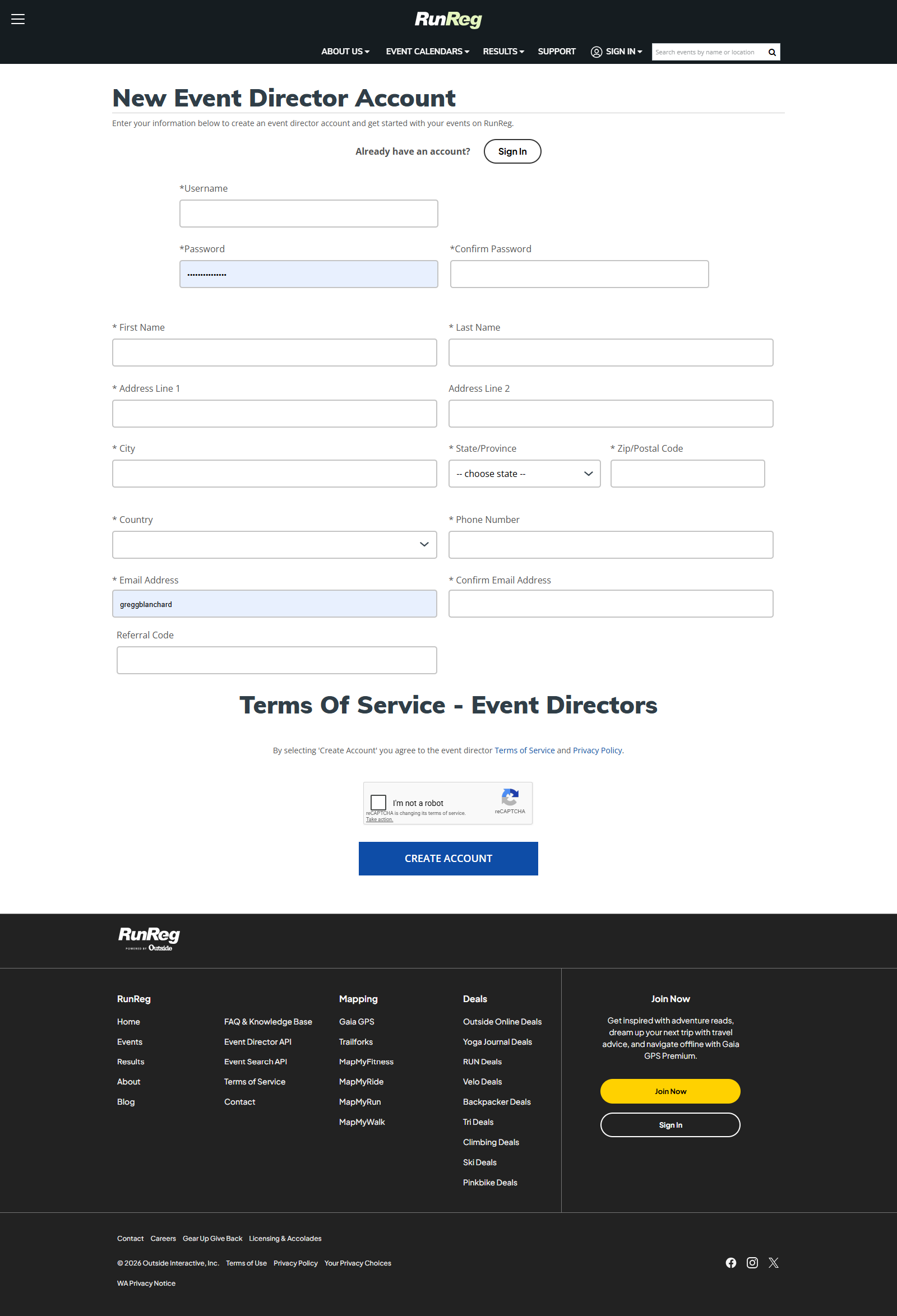
It turns out that the team’s designer had already come up with a beautiful layout for this form that was aligned with the design direction of other pages, but implementing the design appeared to require backend work that made this improvement a huge project. So I proposed we do a CSS-only update instead. The design was already done and, with those files as my guide, in a few hours work we had a new stylesheet they could add to the page.
Round 6: Agent Interface
Finally, the opportunity arose to revisit the UX/UI of an interface that, again, worked great. People who used it genuinely loved it. It just looked…old. Like, really old. And it was hurting the sales process whenever we’d demo it. It finally reached a point that our CTO said it was time.
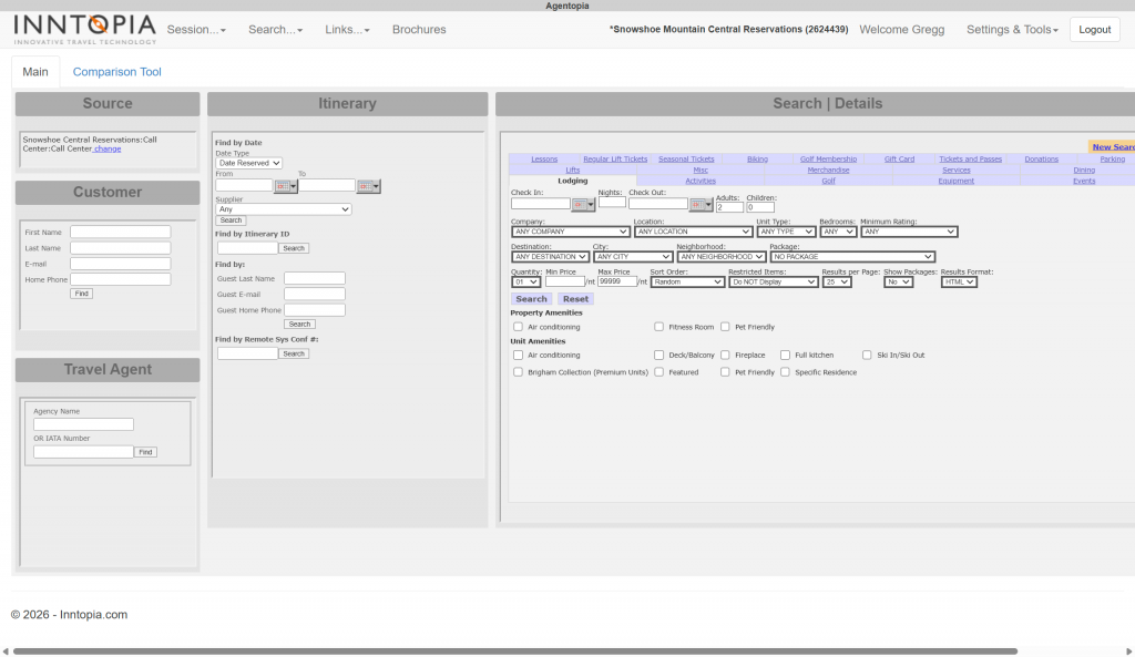
This one was a doozy and I knew it was be more intense that any other I’d worked on, but I spent some time in the code and realized it was fairly well organized with good classes and IDs to work with on the major elements. So I suggested we take this route with the help of the designer who’d done the athleteReg work. The CTO agreed and we got to work. Below is a live test of the new CSS I wrote based on her design.
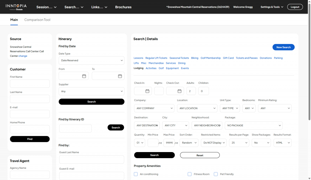
It was amazing to see this one come together and see just how far we could take the design language with just CSS. An interface that would have taken a year to rebuild got a new look in less than 3 weeks thanks to CSS.
Perfect? No. Impactful? Absolutely.
Are these perfect? Of course not. Writing CSS depends on how well classes and IDs are used in the original HTML and sometimes, well, it’s just not possible to make all the change you can envision during a design process.
Even still, as I’ve develop this skill I’m amazed at what I can do with a little bit of creativity and patience. And the biggest aspect? The speed. I’m able to ship things like this now in a matter of days or weeks when the alternative (a full rebuild) is often estimated it 6-12 months or more. Again, these platforms already worked! They just needed a visually refresh and CSS, it turns out, is all it takes to do that.
Do you have an old interface you’d love to see refreshed? Let me know! I’m very intrigued by this approach and how well it applies to other platforms and contexts:
me@greggblanchard.com